We react negatively to a suggested action — even if it’s to our benefit — if we feel it limits our freedom or we’re being pushed into a decision.

Removing friction in fundraising is crucial because even tiny obstacles can dramatically reduce the likelihood that someone will give. Friction is any point of resistance — physical, psychological, or emotional — that makes giving feel harder, slower or riskier. Here’s why removing it matters:
Humans are cognitive misers. We conserve mental energy. If a donation process feels long, confusing or effortful, people are more likely to abandon it even if they care about the cause.
Example: A form with 10 fields vs 3 fields. Guess which one gets more completions?
Fundraising is often driven by emotion. If someone is moved to give in a moment of inspiration, any delay or complexity can cause that emotional spark to fade.
Think of it like heat: Friction cools down hot leads.
Data from behavioural science and fundraising tests show that each added click, field, or delay leads to fewer completions. Even seemingly small frictions (like asking for a title or making someone create an account) can cut conversion rates significantly.
When someone gives they’re doing you a favour, not the other way around. If the process feels like a task they may just skip it or postpone (aka forget).
“Why should I have to search for the donation button?”
Less friction = faster, smoother experiences = a sense of progress and satisfaction. People are more likely to complete the action and feel good about it—making them more likely to do it again.
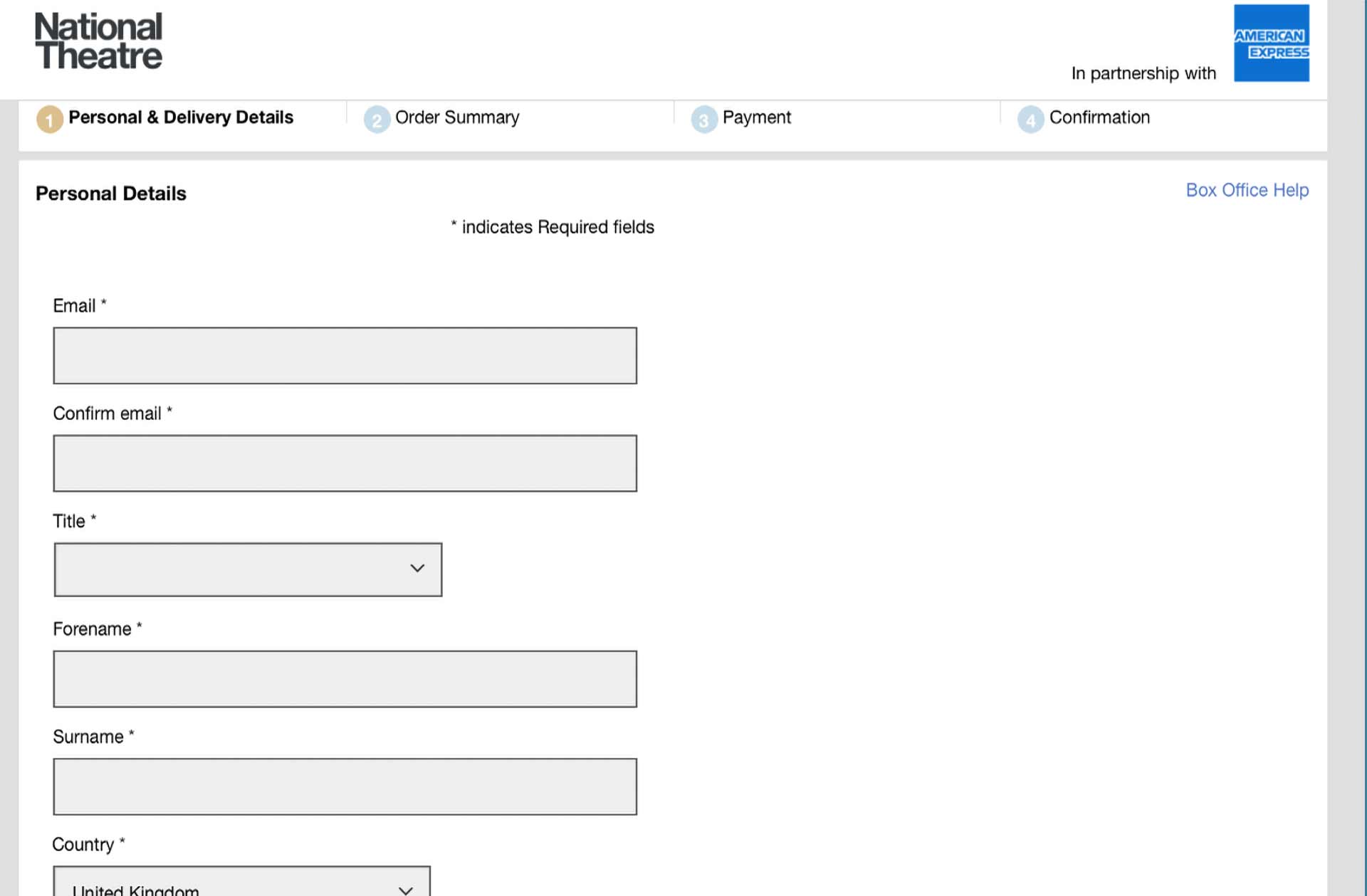
At the National Theatre in London at one point it took twelve screens to make a donation (but only 4 to buy a ticket). That’s friction! See below for an actual example.




On the other hand some companies manage to use friction to their advantage. Glyndebourne Opera Company has a 10-12 year waiting list to become a member. To get on the waiting list requires a first payment of £200 and then a fee of £90 a year for the 10-12 years. And since you ask, no, you don’t get free tickets of marvellous benefits. You mostly get prestige and the chance to pay for access to other exclusive events.
While removing friction is generally good for fundraising, adding friction deliberately can be powerful when we want people to slow down, reflect, or self-regulate.
Here are some great behavioural science examples where friction is useful by design:
The friction: Making people slow down and justify their decisions when hiring.
Example: Researchers found that when hiring managers were asked to write a short justification for why they rejected candidates, they were less likely to show bias against female or minority applicants.
Friction disrupts snap (often biased) judgments by engaging System 2 thinking.
The friction: Limiting access through packaging – blister packs = harder-and purchasing rules-only 16 in a pack.
Example:In the UK, paracetamol (acetaminophen) is sold in blister packs with restricted pack sizes and no bulk sales.
Making it slightly harder to act in a moment of distress saves lives. See example below.
The friction: Artificial scarcity, exclusivity, or even barriers to purchase.
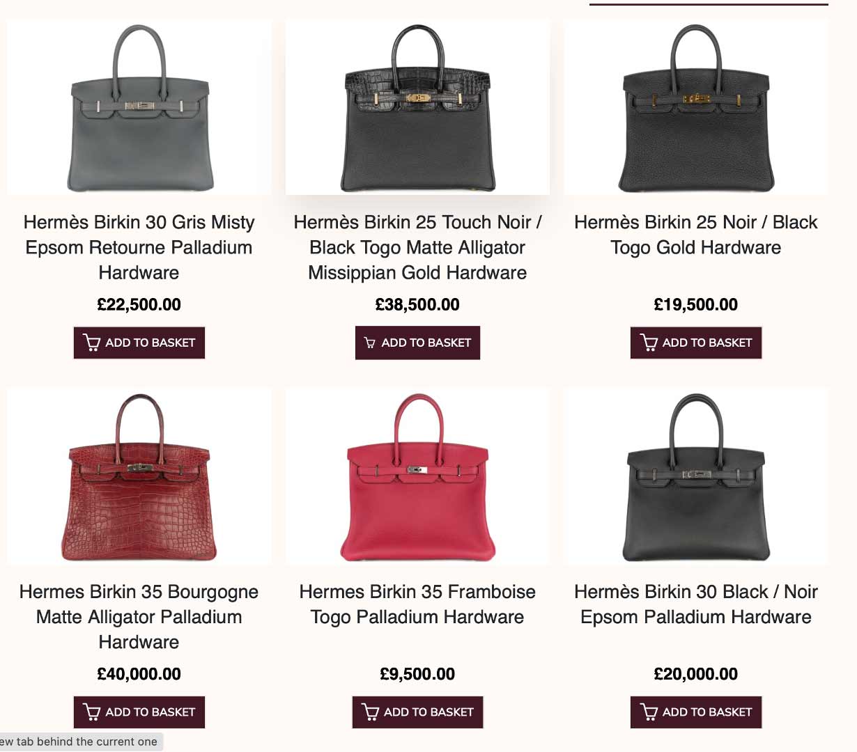
Example: Hermès requires customers to build a purchase history and be approved before buying a Birkin bag. See prices below.
In some contexts, friction adds perceived value and signals prestige.
The friction: A short pause before completing an impulsive purchase.
Example: Some games now include a “cool-off” delay or a confirmation screen for in-app purchases, especially for underage users or when spending exceeds a threshold.
Useful friction protects from regret and overspending.
The friction: Making a future pledge that requires an extra step to cancel.
Example: Some fundraising platforms use “pre-commit” options, e.g. “I’ll donate £10 if I don’t meet my goal this month” which people can opt into.
Behavioural “stickiness” through a speed bump.
Friction is useful when you want to: